


THE IMPORTANCE OF COLORS IN GRAPHIC DESIGN
"The Crucial Importance of Colors in Graphic Design. From emotional associations to cultural perceptions, this article explores how colors influence our reactions and decisions. Learn how choosing the right colors can strengthen your brand and captivate your audience."
Laklay
4/19/20244 min read
The Importance of Colors in Graphic Design
Colors are a universal language and a powerful communication tool. Among all the elements that make up a visual design, color is perhaps the most vital and influential. Research conducted by psychologists and marketing specialists has highlighted how color can influence our emotions and perceptions. Color schemes are often used to highlight particular aspects of a design or to evoke a desired mood or emotion in the viewer.
What colors should you choose for your designs? How can color influence moods and perceptions? How can you use this knowledge to create more effective and compelling designs that resonate with your target audience?
Color, Psychology, and Emotion
Color psychology is the study of how colors affect behaviors and perceptions. "Warm colors" like red, orange, and yellow excite and stimulate, while "cool colors" like blue and green have a relaxing and calming effect. A survey on color-word associations revealed that 43% of people associated blue with reliability and 76% associated red with speed. Another study showed that colors can have a significant impact on consumer behavior. Red signage in store windows attracts more impulse purchases. When it comes to designing marketing materials, a carefully chosen color scheme can evoke emotions in viewers and subconsciously influence their perception of the brand and message. As a guide, color directs the eye and helps highlight what's important.
Color in Marketing and Branding
Numerous academic studies and surveys lend weight to the idea that people strongly associate colors with emotions. Let's examine some commonly used colors in marketing and summarize some of the key findings.

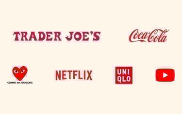
RED: Used by brands like Netflix and Coca-Cola to evoke excitement and energy. Red is a dynamic and stimulating color that increases heart rate and blood pressure, creating a sense of urgency and action.

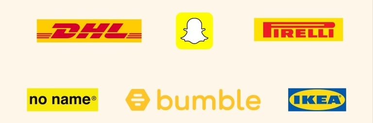
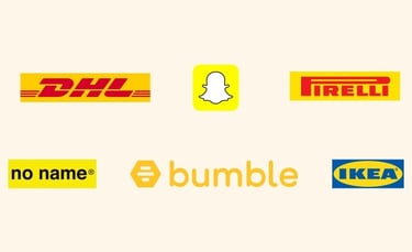

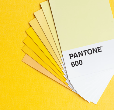
YELLOW: An optimistic color used by brands like Snapchat and Ikea to promote special offers and grab attention. Yellow evokes youth and optimism, and its brightness catches consumers' eyes, especially when used for promotions and special offers.
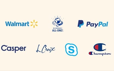
BLUE: Preferred by companies like PayPal, Facebook, and Samsung for its connotation of reliability and professionalism. Blue is a calming color that evokes trust and stability. That's why many major companies choose blue in their visual identity to inspire confidence in their customers.
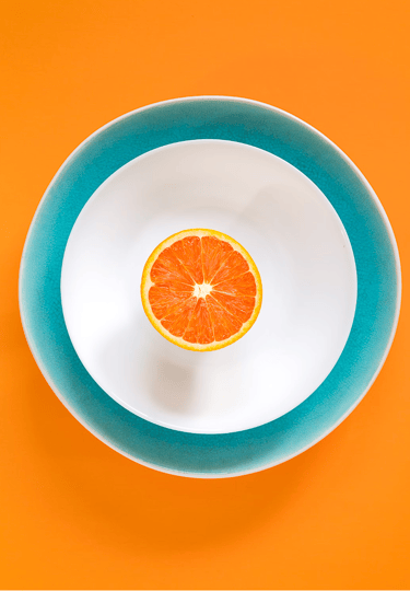
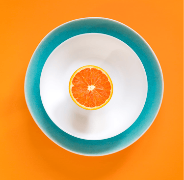
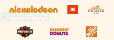
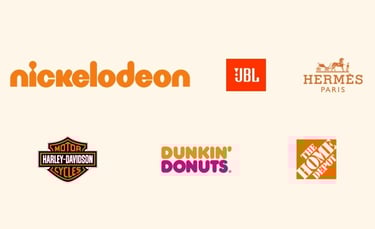
ORANGE: Employed by brands like Hermes and Nickelodeon to communicate enthusiasm and vivacity. Orange is a warm and cheerful color associated with energy and friendliness. It's often used in the leisure and entertainment industry to create a dynamic and engaging atmosphere.
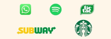
GREEN: Used by companies like Starbucks and Subway to emphasize their commitment to freshness and health. Green is associated with nature, growth, and vitality. It's often used in industries related to the environment, health, and nutrition to convey a message of well-being and sustainability.
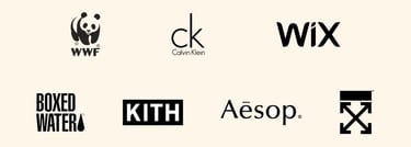
BLACK: Associated with quality and elegance, used by luxury brands like Chanel and Prada. Black is a sophisticated and timeless color, often used to evoke luxury and prestige. It creates a strong contrast and can be used to highlight other colors or visual elements.
Color and the Customer
Whether you're building a brand from scratch or designing marketing materials for an existing brand, it's hard to overstate the importance of color. 80% of consumers believe that color increases brand recognition, and 84.7% cite color as the primary reason for purchasing a particular product. Carefully selected brand colors help create the right impression and differentiate a brand from its competitors. To make the most of color psychology in your marketing, it's helpful to have a clear understanding of your brand's values and personality. Is your brand youthful or mature? Sophisticated? Energetic? Who is your target customer, and what segment of the audience are you targeting? Understanding these elements provides valuable insights that will help you create messages and marketing materials that resonate perfectly with your audience.
CONTACT

ADRESSE : 1 Rue, Jeanne d'arc, Longwy
France - 54400
TEL : +33 (0)6 60 66 76 32
MAIL : sekaigraphicspro@gmail.com
HOME
VISUAL IDENTITY
© 2024 Sekai Graphics – Tous droits réservés
OUR SERVICES
WEBSITE / E-COMMERCE / LOGO / SEO / ILLUSTRATION / FLYER / ANIMATION / VIDEO / POSTER / SIGNAGE / BUSINESS CARD / ADVERTISING / DRAWING / VISUAL IDENTITY / ONLINE STORE / WEB DESIGN / GRAPHICS / MARKETING / PACKAGING / COMMUNICATION
SEKAI GRAPHICS